That Boutique-y Gin Company, owned by Master of Malt, is loved for its bold, flavour-packed gins and craft cocktails.
As part of the rebrand, the idea is to tone down the quirky illustrated labels and create a more unified look that still puts flavour front and centre, while appealing to a broader audience.
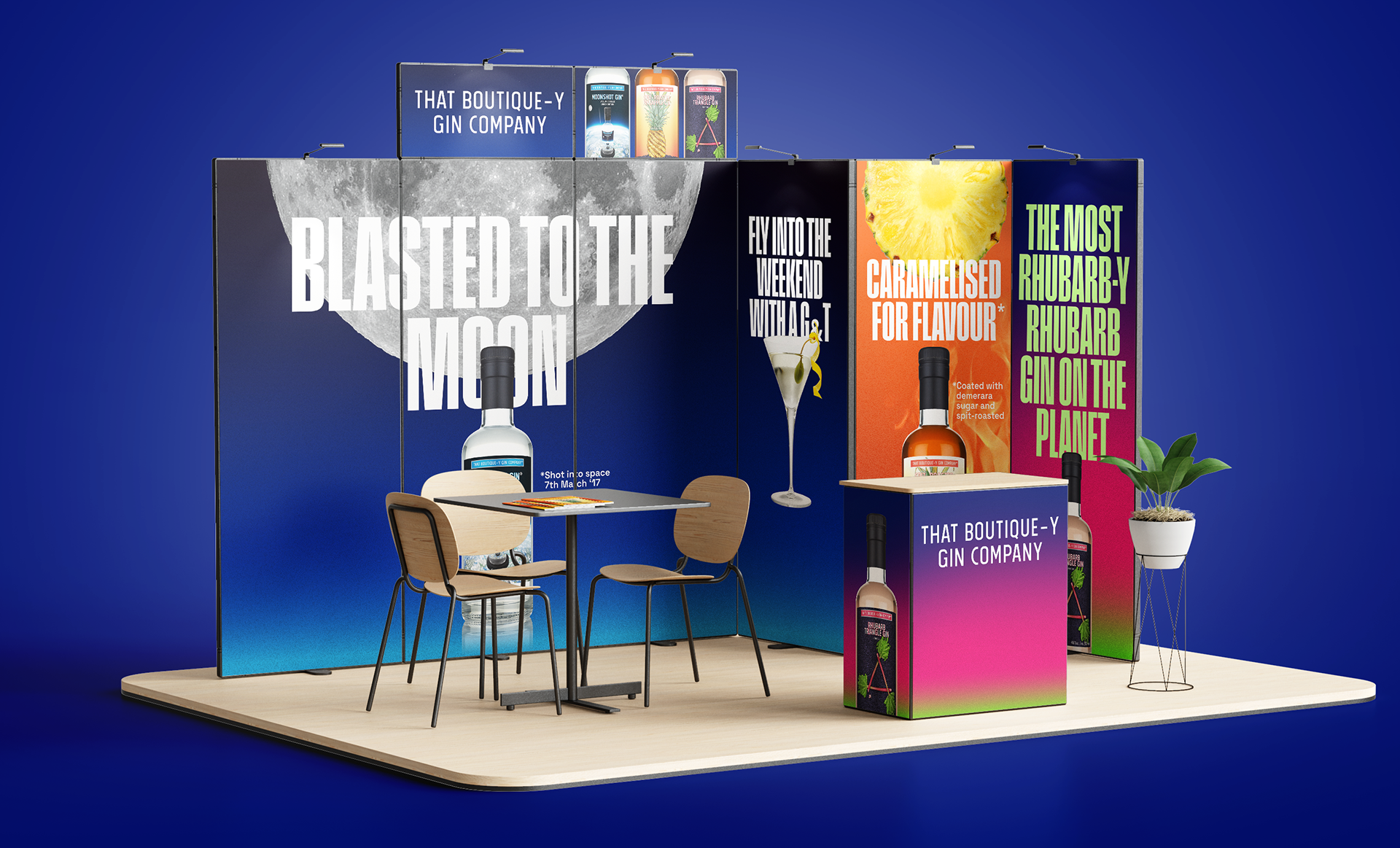
The background colours are inspired by the original label palette—paying tribute to the brand’s roots while stepping forward with a bold typographic style that highlights key ingredients, flavours, and playful messaging.