Click for commentary
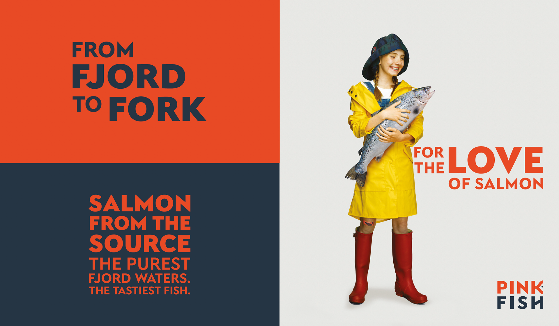
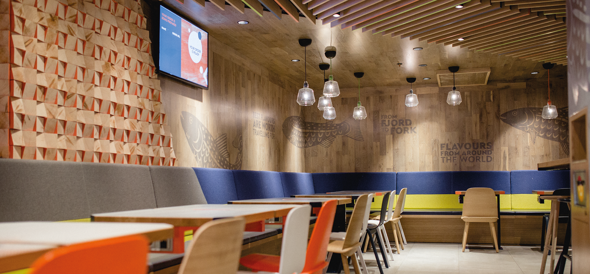
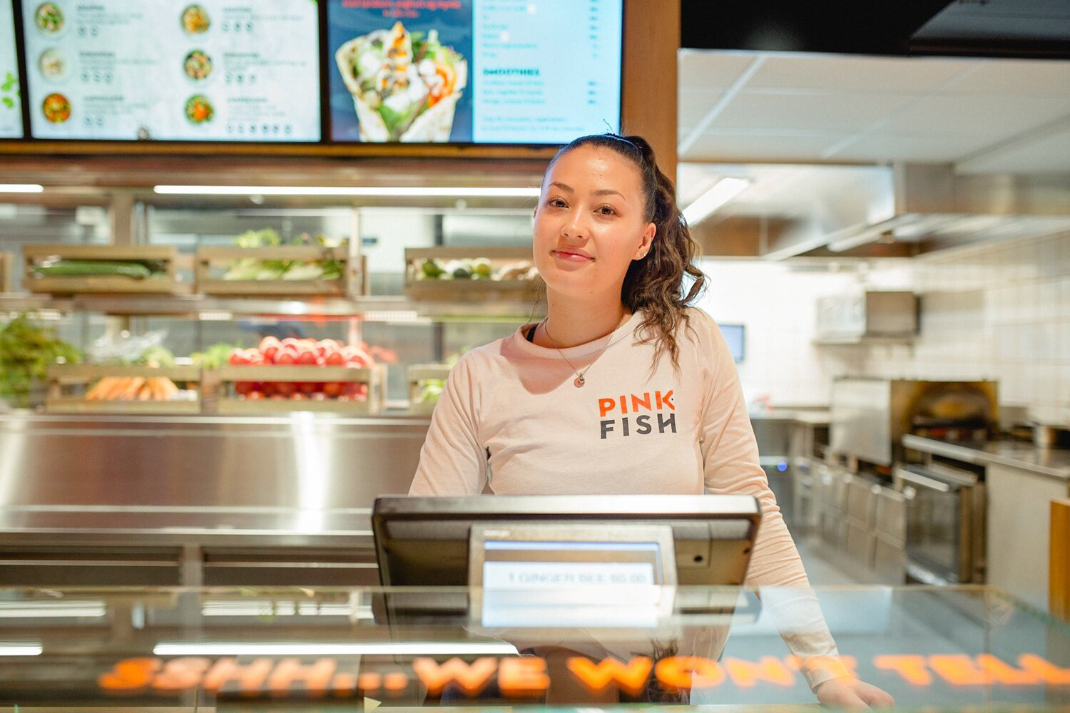
While working at Portland Design, a Norway-based client came to us with a brief to create a new brand for a fast-casual dining restaurant that serves farmed salmon as its main ingredient.
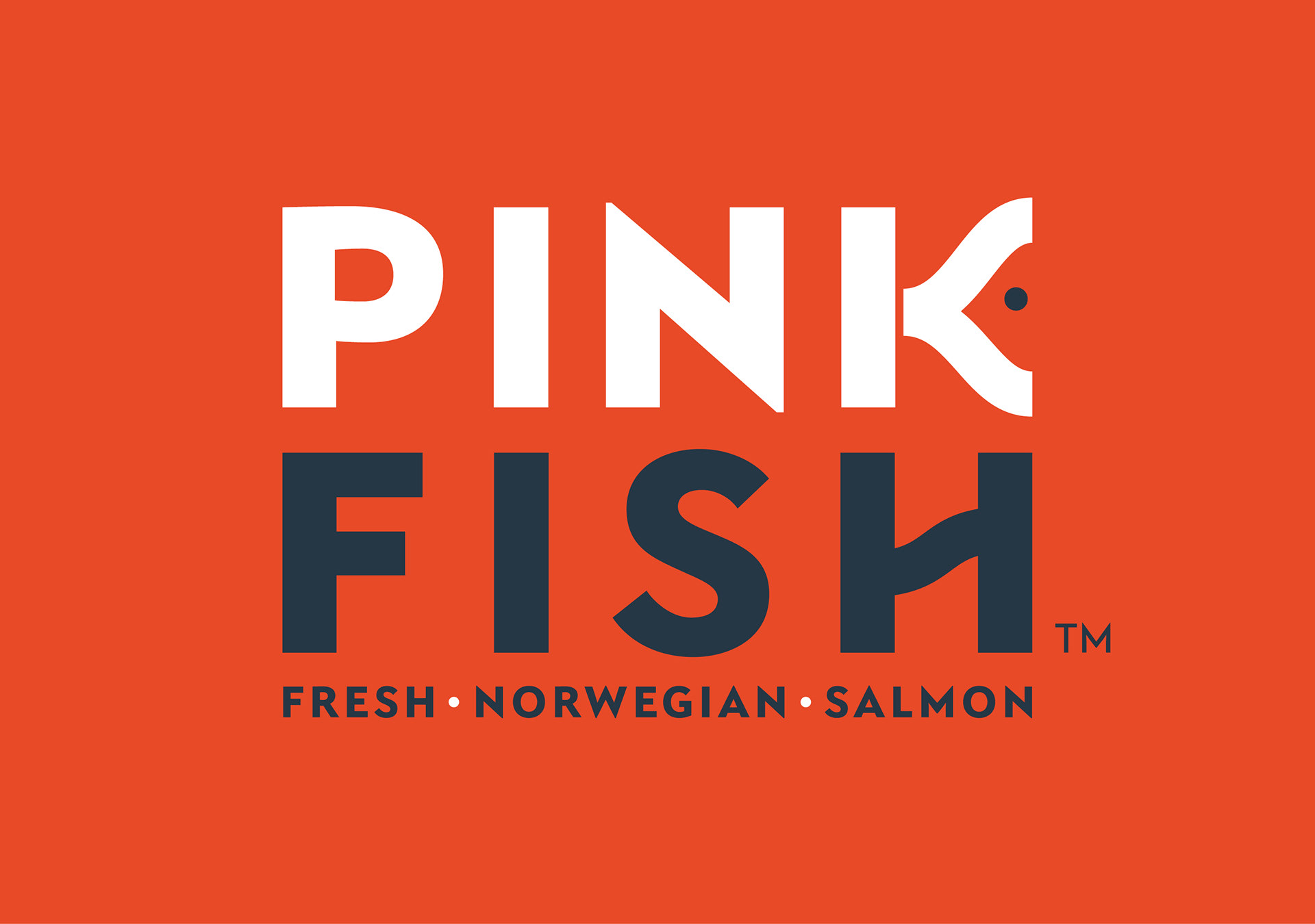
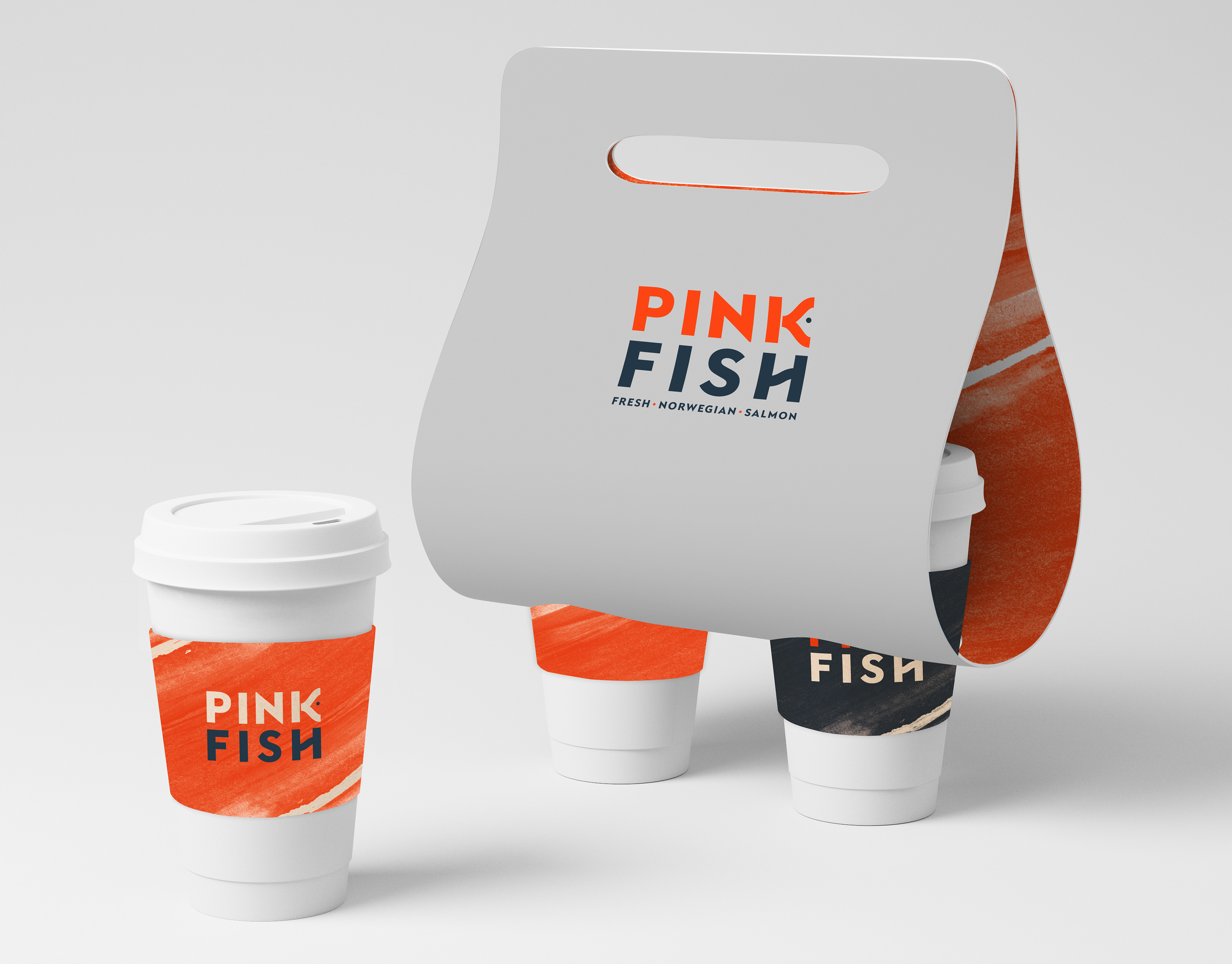
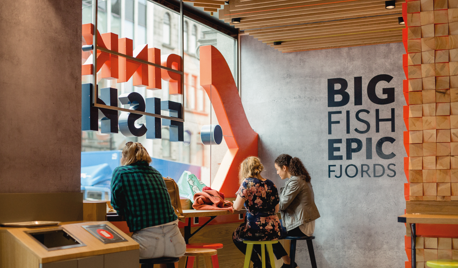
I was involved with the name generation for the brand. Out of the many, my idea for 'Pink Fish' was selected as it was memorable and snappy, and it had a strong visual correlation to the product they were promoting.
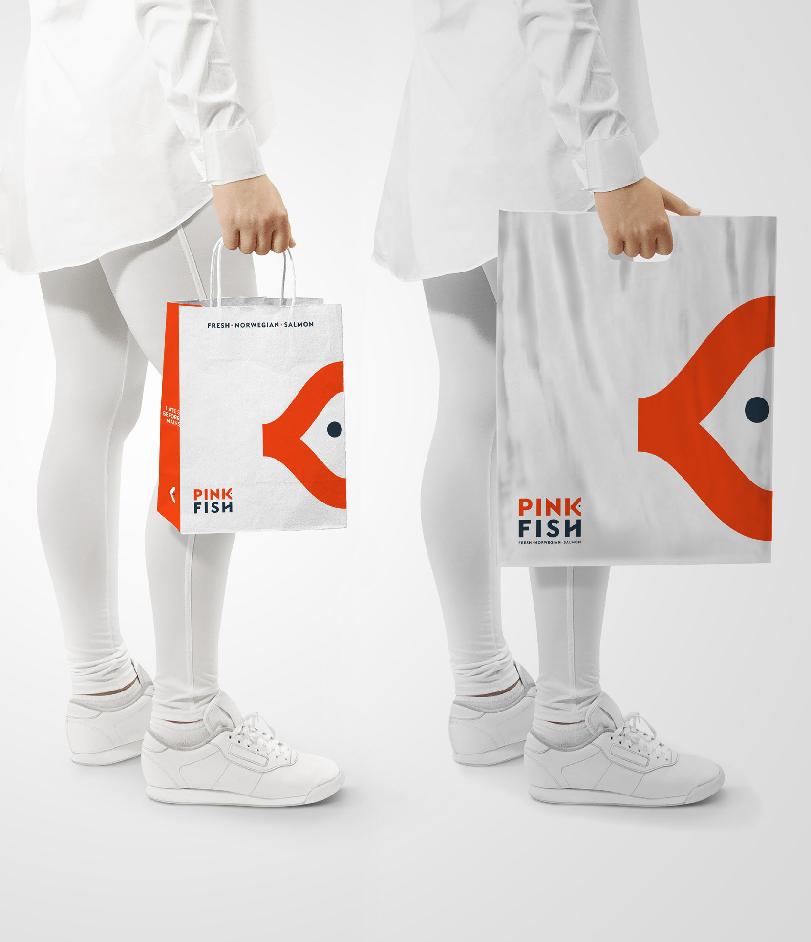
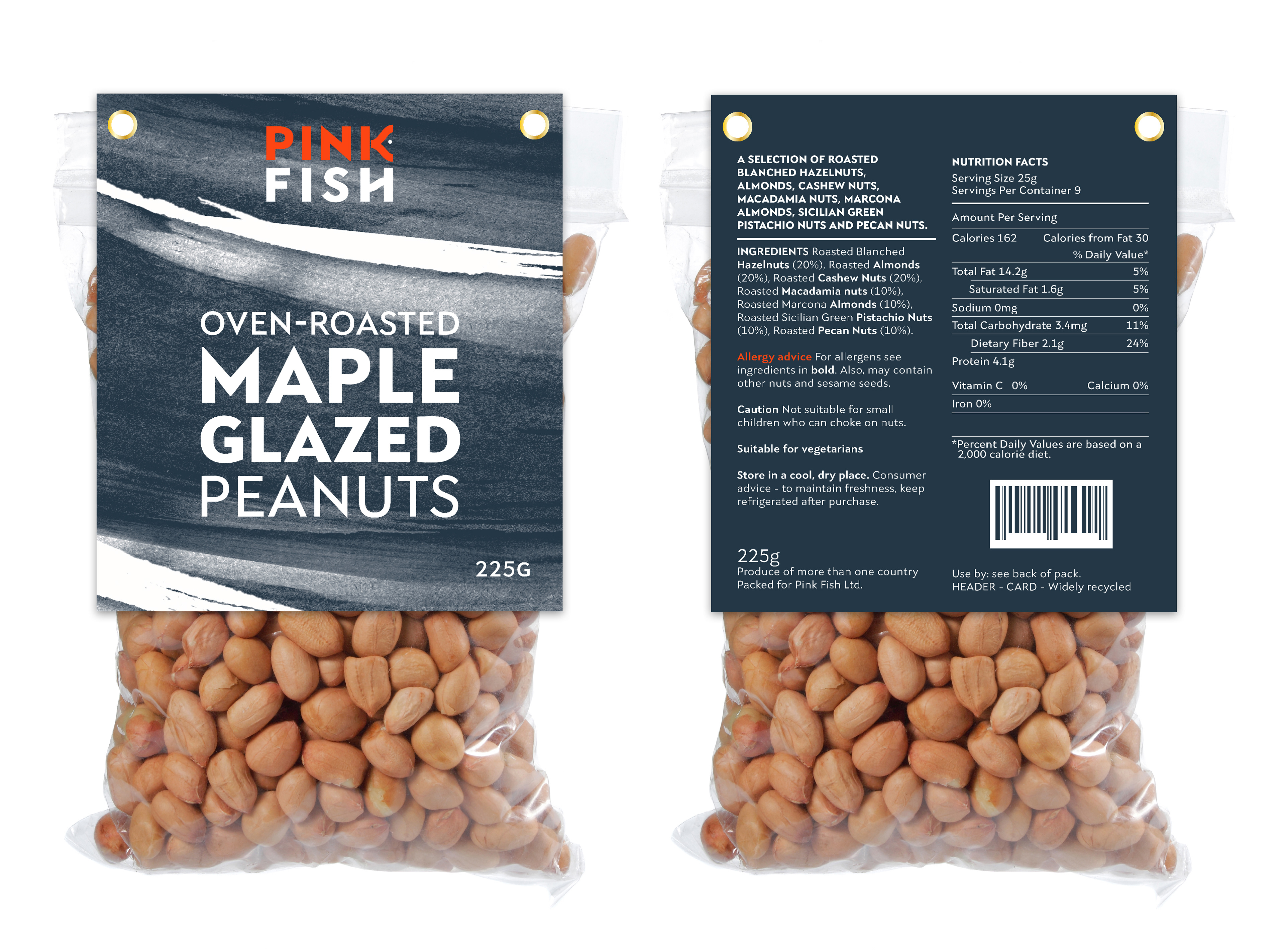
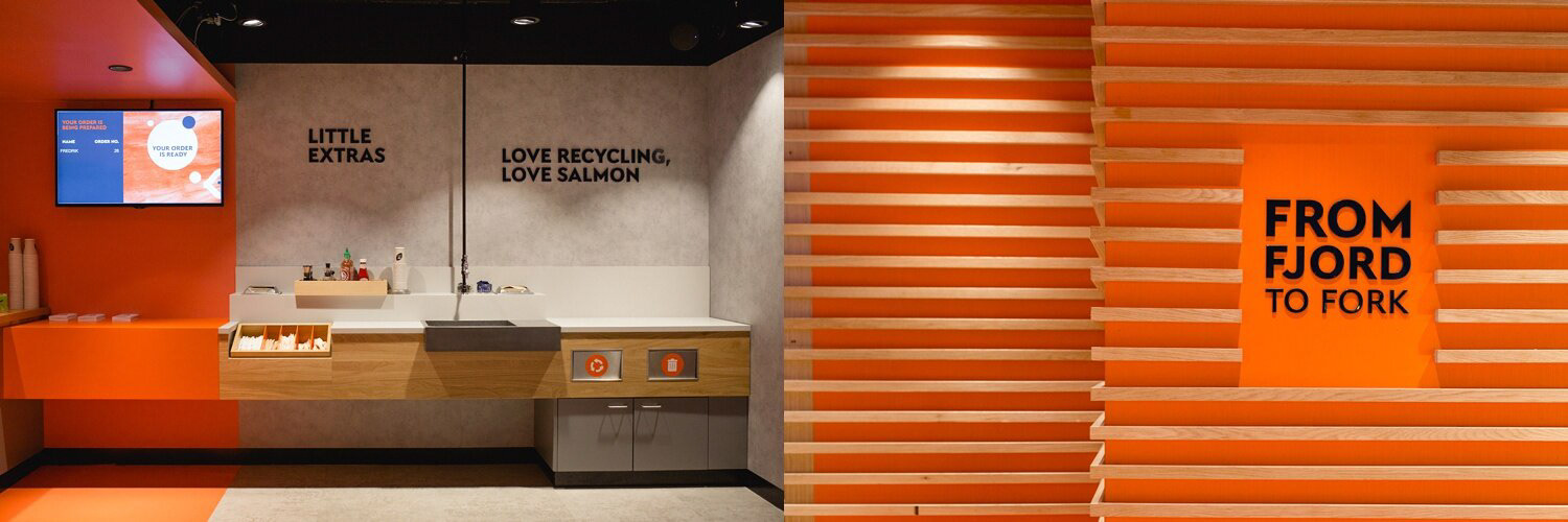
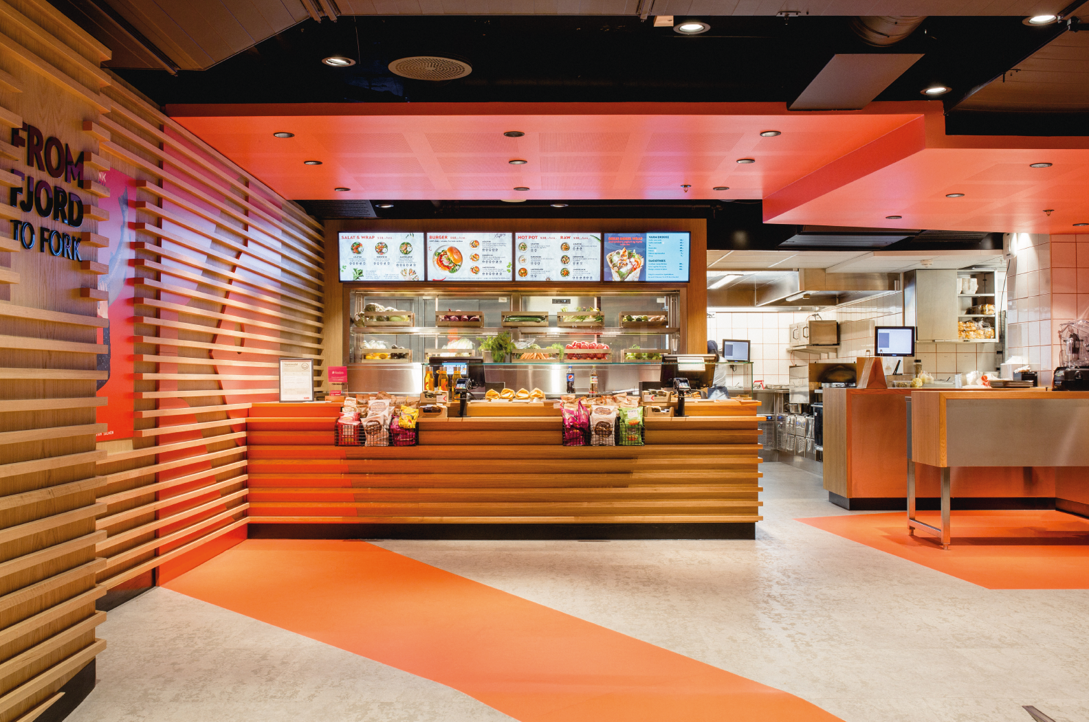
The logotype was crafted so that the 'k' became a symbol that could be used in many ways throughout the brand roll-out. Under guidance from the creative director, I worked closely with the interiors team to ensure that the brand was well-encapsulated in every shape and form.